
TURQUOISE
by EUDES CORREIA
ROLES
UX/UI DESIGN
PROJECT DURATION
8 Days
TOOLS
FIGMA | FIGJAM | STICKY-NOTES | GOOGLE DOCS


Eudes Correia, is a famous watercolour artist known all over the world, who also offers painting courses. For this project, we got the honor to redesign his website, with the focus on the checkout flow.
Our goal is to make the journey to the payment, as enjoyable as possible. We used Mister Correia’s art as inspiration and organized the website to sort out the main problem identified during our interviews and tests.
Problem Statement: Users need to have an organized, trackable and clear course platform with support, because they feel anxious since there’s lack of information, support and management of the course.
WHAT HAPPENED
Our project began with an intensive brainstorming session, where we gathered everything we knew about painting and education.
We analyzed the current website to understand the pain points during the user journey and compared to other competitors to start writing down what to optimize.

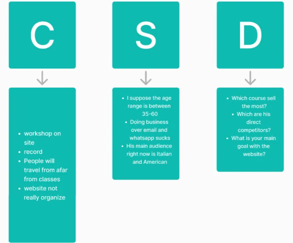
The results of the analysis led us to categorize all the informations in a CSD Matrics and to proceed with the interviews to the users, the stakeholder and the assistant.
INTERVIEWS
We interviewed 6 users, including the stakeholder and the assistant. We gathered precious informations which have been re-organized in a affinity map. About the users, we focused on the expectations from the course and what they would have changed or improve from their experience. From the stakeholder, we gathered important insights about the course, the structure and the behind the scenes. We particulary liked how he defined the atmosphere during his course: feels like Brazil. Last but not least, the assistant. She helped us to understand the difficulties of the organization of the emails. Also, she told us the most frequent bad and good feedback from the users.

Collected all the informations, we created three personas:
Valentina Rossi — A architecture Designer from Italy who doesn’t speak english very well. She is about to join a course but she has troubles to find all the informations needed, she can’t communicate with the facilitator and would love to have a certification of attendency
Stevie di Giorno — He is an event’s organizer. He would love to create a community of watercolours painters but he doesn’t have a direct contact with the painter and he get late answers.
Maria Carvalho — She is the assistant of the painter hosting the course. She would love to have a feature in the website to centralize all the requests coming cause she is overloaded and unorganized.

The research helped us to understand where to focus our attention. For this project, we decided to sort out users problems and concerns. That’s how we elaborated our problem statement:
Users need to have an organized, trackable and clear course platform with support, because they feel anxious since there’s lack of information, support and management of the course.
IDEATION
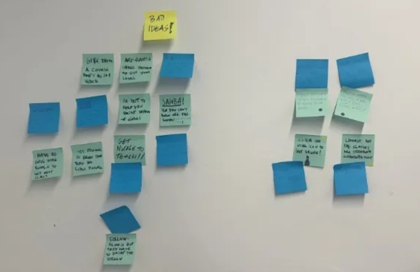
The first step of our ideation has been: WORST IDEAS.
We decided to go with this method first, based on the joyful atmosphere of the courses. The results led us to brainstorm about how to categorize the courses up to the skills of the students.
LOW FIDELITY PROTOTYPE
We wireframed the first sketch of the website and conducted a usability test with 5 users.

We asked the users to describe the page and to go towards the checkout page.
The feedback led us to redesign completely the course page since it was lacking of organization and the course description page.
We created a user flow and together we run a card sorting testing:
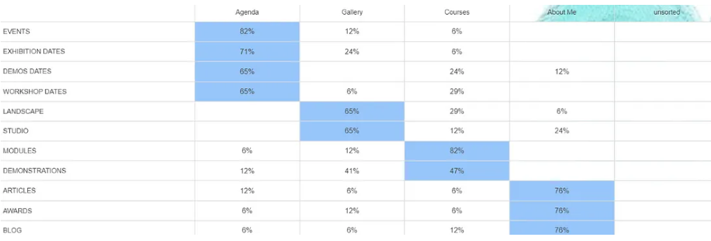
The card sorting results were pretty satisfying since we forecast 90% of the users behaviour for the checkout.

Second step, mid-fidelity prototype.
We prototyped and tested the mid-fidelity for both desktop and mobile versions:

HIGH FIDELITY PROTOTYPE
For the high fidelity prototype we decided to keep the colors of the website and the logo:

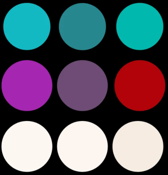
We created a MOODBOARD with turquoise as dominant color to get inspiration from:

As background decor, we used watercolour splashes:

FONT: INTER 32PX INTER 16–24PX
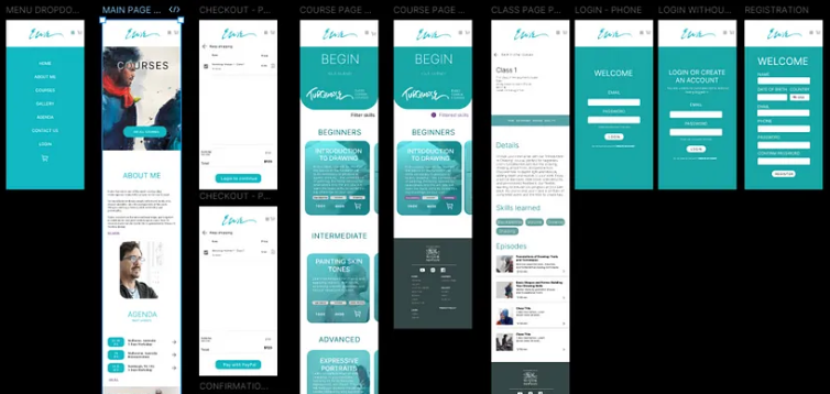
MOBILE PROTOTYPE
You can find the presentation of the Mobile high fidelity prototype HERE
DESKTOP PROTOTYPE

You can find the video of the Mobile high fidelity prototype HERE
CONCLUSION
To wrap up: with this new design we tried to give a high quality experience to the users, providing clear informations and a good looking website. We kept the soul of the business, Turquoise, playing with the colors of the original website but keeping the consistency.
THANK YOU